One thing that I have learned is that the styling of your shop really matters when it comes to building your brand name. Continuity is important in your photos, as is the background or props you use in your photos.
I experimented with various props and backgrounds for my photos, and eventually found something that works well for me. I take my photos on top of a little wooden desk near a window. I use a painted snack tray as my prop... that's it! I got it for $1.50 and paid $5 for a can of aqua paint :)
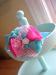
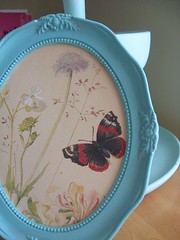
Frames, pretty cups and dishes, suitcases, books, old paper, cake stands, and old bakeware are all great ideas. If you want to go all out.. you could find an old table and set up a little display. Experiment and see what you can find!
You should be able to find some great photo props on a really small budget. Check thrift stores and garage sales for items - don't overlook something if all it needs is a quick coat of paint! I purchased a can of high adhesion primer for $15 and a few cans of $5-10 spraypaint and I have painted *so* many things! :)
Don't forget about your background... try to find an interesting background like a colored or textured wall, window sill, eldger paper, table top, or even some grass (fake, or real!)
Examples of shops who's styling I love:
Janesays
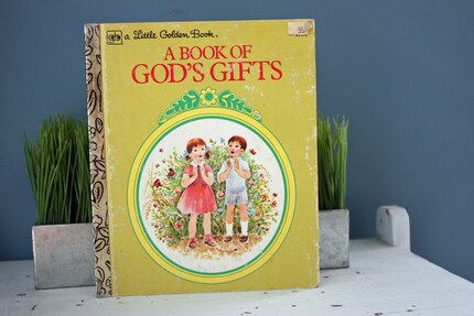
Amy Hatch
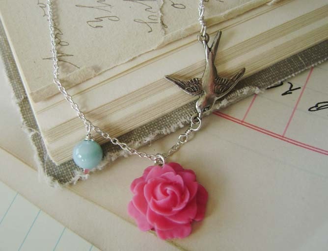
Modish Vintage
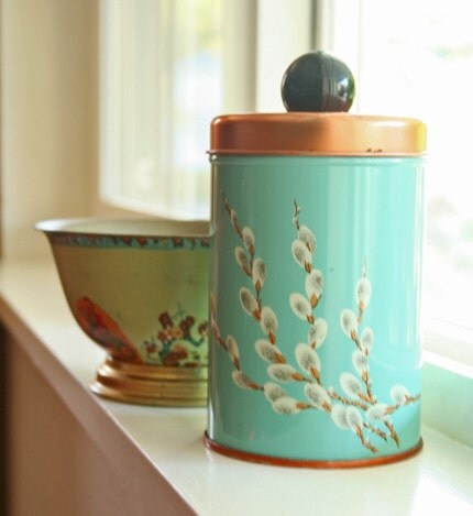
Japonicas
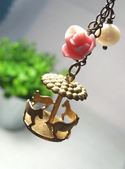
Shabbyvintagemom
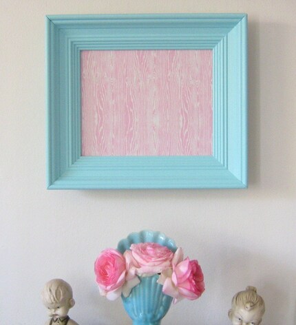
Tenthings
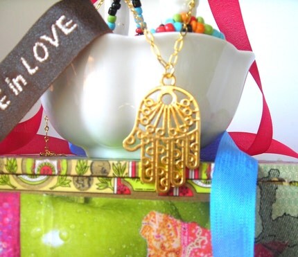
GreenBriar
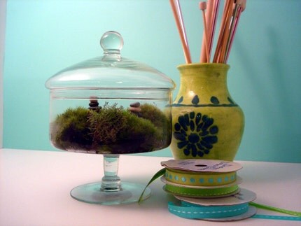
Jennysbakeshop
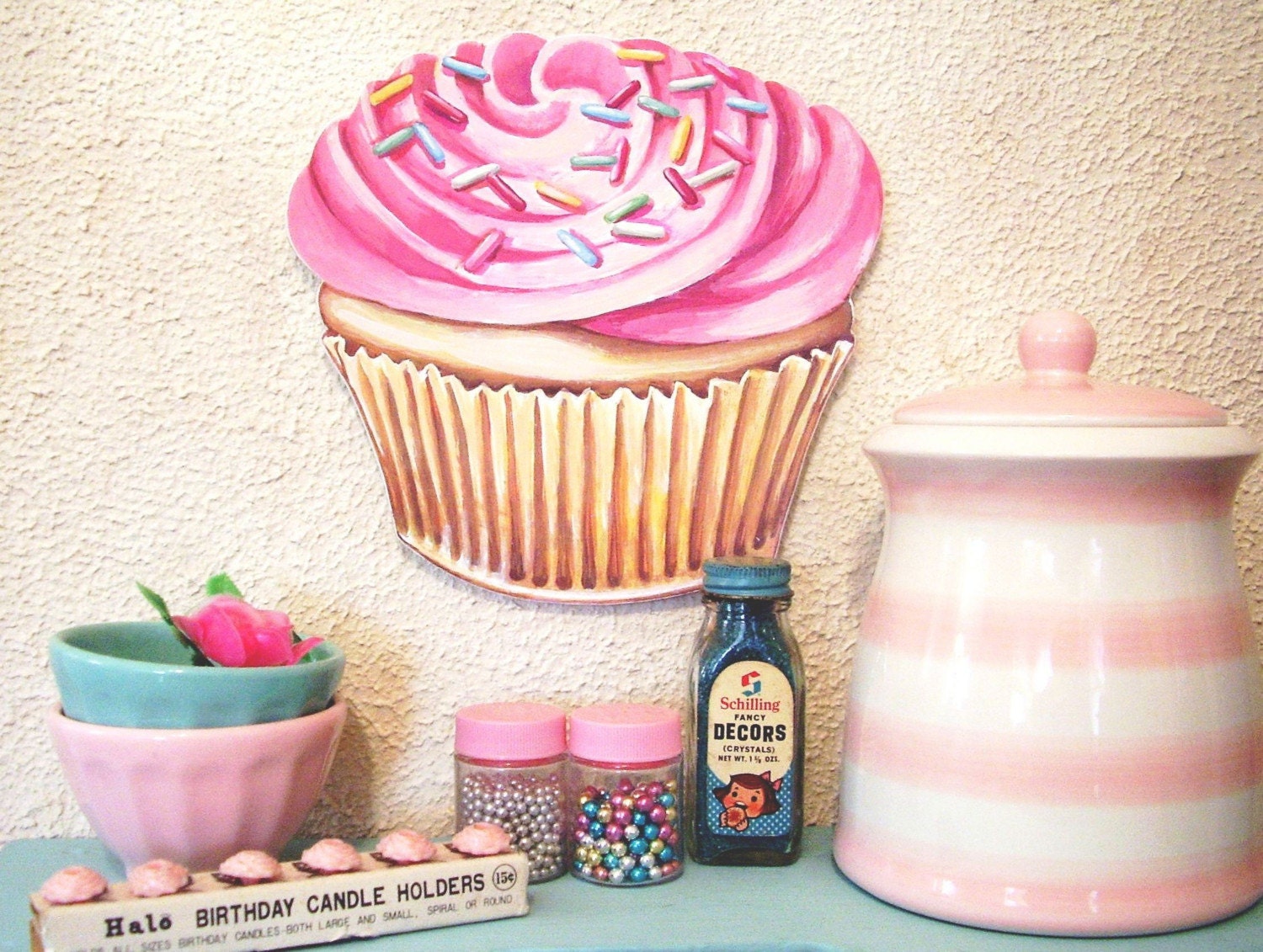
SeaUnicorn


 Please bare with me as I make some layout changes :)


11 comments:
Your blog always looks so good! It really has a certain look and everything goes together so well.
A wonderful post! Staging items for product photos is so important. I'll tweet about this!
Thanks for the great tips, I will be trying them out for my next photos.
I still have yet to find the perfect prop-styling style for my shop. I switched to a creme colored flokati rug about 4 months into my shop, and while I LOVE it, I'm not sure it's interesting enough, visually. I really need to set up a display that would showcase my stuff, without taking away from it. It's hard with sewn items... you can't really hang them from something or drape them without distorting what they are. Your only real options are to lay them on something...
I used to use a WWII era ephemera book as my backdrop... each page was fun and colorful and gave off a certain vibe, but it didn't evoke softness of coziness... which is kind of what http://softandcozy.etsy.com is all about.
Great post with beautiful example images. Inspiring!
Great post & advice!! I am still trying to brainstorm a ideal showcase for my purses! It's killing me!
~Michele from By Your Side
It's harder than you'd think, isn't it! :)
oh! seaunicorn's set ups are great! thanks for sharing
oh the ideas are great~
is there any way we can style up the background for clothes modelling? coz one of the problem is that we'll have not enough natural lighting if it's inside the room..
another thing is that the background props might be too small to be seen..
hope you can do a post on how to set up props for vintage clothes biz..thanks dear!
Wow that really gives one something to think about, It not something I thought made a difference, I try to just take close ups with a solid background. But, I see it does make a difference. Thanks so much for the information.
I'm working on staging right now, and I'm partial to Seaunicorn as well as your wonderful backdrops. Thanks for the helpful tips!
Post a Comment